
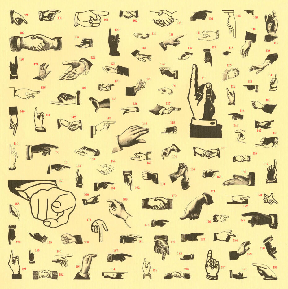
Manicules
The little hand.

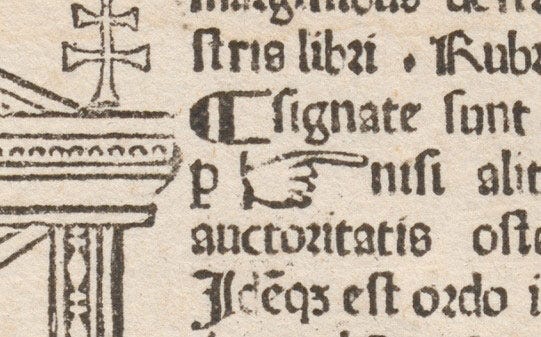
The manicule (little hand) first appeared in 1479.1
William Sherman ‘s essay, “Toward a History of the Manicule,” dates the manicule’s printed appearance to 1484,2 in a book of canon law in Lyon by Mathias Huss and Johann Schabeler (in the Breviarium totius juris canonici), but John Broadley found an earlier version in the first edition of that same summary of canon law compiled by Paolo Attavanti (also known as Father Paul of Florence) printed in Milan by the German firm of Leonhard Pachel and Ulrich Scinzenzeller, on August 28, 1479.3
Shady Characters has a chapter on the Manicule
Keith Houston dedicates a chapter in his book, Shady Characters: The Secret Life of Punctuation, Symbols, and Other Typographical Marks, to the manicule, detailing its origins in medieval manuscripts, such as the Domesday Book (1086), and its widespread use during the Renaissance.4 He explores how the manicule transitioned from handwritten marginalia to printed symbols and its later use in 19th-century advertising and modern digital interfaces (e.g., the cursor hand icon).
The Secret History of the Manicule, the Little Hand that’s Everywhere (blog post by MessyNessy)
The blog, MESSYNESSY, has a cheerful history of the manicule: The Secret History of the Manicule, the Little Hand that’s Everywhere in which the author notes:
Software designers have used variations of the hand icon to indicate everything from draggable objects to interactive buttons. In design terms, it’s a direct continuation of the symbol’s original purpose: drawing attention and indicating interaction. The manicule also sneaked into our fonts and emoji sets. Microsoft’s infamous Wingdings font (1990) included a pointing index hand, and today Unicode officially codifies manicule emojis pointing in all four directions.
Breviarium totius juris canonici, compiled by Paolo Attavanti (also known as Father Paul of Florence) but printed in Milan by the German firm of Leonhard Pachel and Ulrich Scinzenzeller, on August 28, 1479 noted in “Point, Don’t Point” by John Boardley at the blog, I Love Typography.
William Sherman, "Chapter 2. Toward a History of the Manicule." In his Used Books: Marking Readers in Renaissance England, Philadelphia: University of Pennsylvania Press, 2010, pp. 25-52. https://doi.org/10.9783/9780812203448.25
Boardley, John, “Point, Don’t Point” essay at the blog, I Love Typography.
Houston, Keith. 2013. Shady Characters : Ampersands, Interrobangs and Other Typographical Curiosities. London: Particular Books.
Wonderful. So neat.
==> and let's not forget a bonus from our hostess: Messy Nessy Chic!
Great fun, again! Thank you!